This is the tenth in our series on common Power BI mistakes.
You can find the other articles here
So, you’ve hooked up and manipulated your data, and organised it into a beautiful star schema.
Minimalism, a concept encompassing visual arts, music, design, architecture and more, emphasises stripping things down to essential elements only, often with multifunctional purposes. Architect Ludwig Mies van der Rohe‘s minimalist mantra “Less is more,” was coined in 1947. Originally highlighting his penchant for acts like designing floors to serve as radiators and removing non-essential interior walls to create a barrier-free living, it’s now a universal principle wherever minimalism is applied.
I should probably pause here to confirm I’ve not taken leave of my senses nor started a misplaced blog on architectural design principles.
You see, the “less is more” principle has two main and very important applications when creating reports in Power BI:
- Optimising a report page to reduce page load times
- Reducing visual clutter to make information easily consumable for your stakeholders
Optimise report pages to speed up page loading
If you’ve ever tried to buy tickets for major events like Glastonbury or Taylor Swift concerts, you’ll be familiar with ticket websites’ holding pages. These stagger access to the ticketing page to prevent too many people accessing it at once and crashing their server.
When developing anything in Power BI, you should adopt a similar principle.
I don’t mean making people queue to access your reports, but rather, minimising the amount of visuals and items on a report page to avoid system overload.
Each visual and item impacts page loading times. So the more visuals you use, the worse your report performance will be. And multiple poorly-performing reports within your organisation will have widespread impacts, ranging from overloaded Premium capacities to a loss of trust in reporting.
Why do too many visuals and items affect page loading speed?
Why do too many visuals and items affect page loading speed?
It’s fairly logical that a larger number of data-producing visuals will produce a larger number of queries for your data model to handle.
Answering each query uses valuable resources, and meanwhile those resources aren’t available to answer other queries. So some queries may take longer than normal or have to wait altogether.
However, there’s another, perhaps less logical thing to note here:
Items or visuals that do not produce data — e.g. icons, shapes, buttons, text boxes — will also slow down your page load times. All of these require processing, which always happens before the first visual query is sent to the data model. So the more of these items you have, the longer your data visuals will have to wait.
For helpful information on how you can witness this in action and run some tests on your report, I recommend this blog from the excellent Chris Webb.
How minimising visuals helps speed up page load times
How minimising visuals helps speed up page load times
Let’s dive into a bit of under-the-hood knowledge on how cutting back on visuals can reduce page load times by reducing the number of queries sent to your model.
It all comes down to a process called DAX Fusion, which aims to combine queries that run over the same table if they’re all affected by the same filters. This reduces the number of Storage Engine queries required.
With DAX Fusion in place, one visual with four measures that calculate over the same table (such as SUM, AVERAGE, COUNT or MIN/MAX) will submit one query. Whereas four visuals with each of these measures separated will submit four queries, taking longer to produce the end result.
For anyone wishing to understand more about this, I recommend this blog from the also excellent Phil Seamark.
So, cut down on these items, and combine all of your measures into as few visuals as possible. Fortunately, the introduction of the new card visual – possibly the single best thing Microsoft have done with Power BI in the years I’ve been using it – should really help with this task.
Reduce visual clutter to improve readability
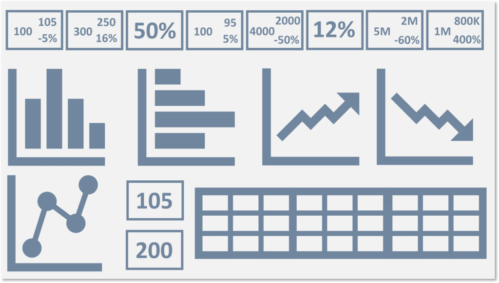
Too many figures in one report can lead to visual overload, disorientation and confusion, take Figure 1 for an example, it’s hard to know where to start and frankly I’m beginning to feel a bit woozy looking at it.
When I’m not trying to eke every ounce of performance out of Power BI data models and reports, I focus on refining report designs. These designs align tightly to my visual principles while also ensuring they are both informative and easily digestible for my stakeholders, telling a story or enabling self-exploration.
This can be quite the task. Especially when said stakeholders insist all 300 of their metrics are vital and must be monitored simultaneously, with a comparison to the previous year to boot.
If you don’t contest this assertion, you’ll find it hard to achieve fast page loading. Even when (if) it loads, the clutter of items will make it tough to draw your stakeholders’ eyes to the most important data.
Key pointers to reduce visual clutter
Key pointers to reduce visual clutter
To avoid this visual overload and disorientation, develop report pages with specific and focused directions, perhaps targeting 4–6 key metrics on each page. These key metrics need to directly impact the process or outputs being analysed. Metrics that form a step in the process or might have an impact on the output, then consider them as supporting or secondary information.
If the chart isn’t vital to the analysis required, and merely supports or enables further explanation it can be moved to an alternative or drill through page.
When comparing data from different time periods, be creative about how you display this — perhaps with an icon, conditional formatting or through a KPI chart. You don’t have to display the previous value, the difference to the current value and the % change all at once. Find out which is the most relevant to your stakeholder and perhaps display the other two in a pop-up tooltip or by using reference labels.
If you have a large amount of key metrics, consider the use of bookmarks or field parameters to switch between them.
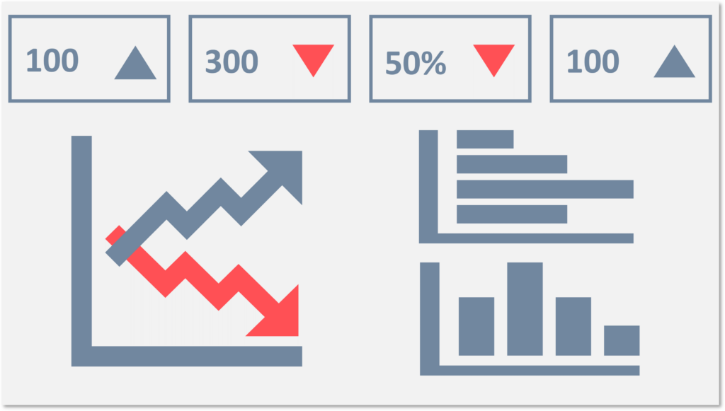
In Figure 2, I have cleaned up the page from Figure 1 using these principles. Some of the information has been assessed as secondary and take off, some charts have been merged into one and the KPIs have been trimmed significantly. Any information lost from this page will be found elsewhere in the report so that it is still accessible.
Wrapping Up
This isn’t an extensive list of ways you can reduce visual clutter, as I’ve limited it to just a few of Power BI’s tricks. There are many things you can do before you even begin developing a report, but I’ll save those for a future blog focusing on visual design.
My aim here is simply to persuade you that there’s more than one reason to ensure your report doesn’t look like an old-fashioned airport departures display board or an aeroplane cockpit. Follow the advice above to streamline a report page without spending hours finetuning DAX (although don’t disregard DAX optimisation completely), and to help your stakeholders take in critical information without having to search for it.